Showing posts with label Designer Tips. Show all posts

How to fix an awkward apostrophe

This is my first post like this, so I hope it makes sense and I don't totally lose you! This may seem a little random, but I've been seeing the following issue a lot lately:

This kind of apostrophe mishap can happen for a number of reasons. Sometimes the font has issues when it gets bigger, or sometimes a font doesn't come with an apostrophe. Whatever the reason, this is such an easy fix. I'll show you how to do it in Photoshop, but you can do it across the Adobe programs. You can also do this to fix fonts that aren't totally aligned on the bottom, which happens a lot with handwriting fonts.

The issue: My problem here is is opposite, the apostrophe is too high, but you fix it the same way.


Step 1: Highlight just the apostrophe


Step 2: Go to the Window menu and click on Character. A new menu will pop up, as shown on the right side of this picture


Step 3: Go to the box with a big A, little a, and arrow under the little a. There is a close up picture below this first one. Right now the number will be zero, highlight it. If you want to move the apostrophe down, then hit the down arrow on your keyboard, if you want to move it up, hit the up arrow. Just keep hitting the arrow until you have it where you want it.

Close up:


Step 4: I ended up having mine a -3.84. Play around with decimal points until it's where you want it. Next, make sure it's aligned properly. You can make a blue measurement line like the one below by pulling it down from the ruler, which has a red arrow pointing to it. Simply click on the ruler, hold, and drag down to where you want it. Once you know it's aligned you can make the blue line go away by pressing "command, semicolon" on a mac (sorry I don't know PC shortcuts), or just go to View, Show, Guides.

And that's it! Your apostrophe is no longer awkward. Hopefully this post wasn't completely pointless, and hopefully I didn't totally confuse you. Let me know if it all made sense or if there is something I should clear up/change? If there are any design issues or frustrations that you're having let me know, I'll see if I can help.

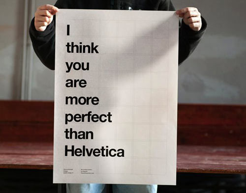
And just for fun, here is a birthday invite I made a little bit ago. Kelsey wanted a copy cat of this little beauty, I just left some of the fluffy stuff out at the bottom cause I thought it looked cleaner this way. The offer to make your printables/invites/announcements for free is still going, I need to keep building my portfolio :)

Resume 101

My office at work is next to the marketing office. Bookstore marketing is run by two students, Hillary and Yulee. They are amazing and delightful and I love them. The issue is that Yulee is graduating in December and will be leaving us forever. Through the depression, marketing is looking for a new employee. Someone in the communications department, someone with longevity, someone with experience. I guess the applications have been pretty disappointing so far. They either get people with amazing resumes but no longevity, or people who will be here for years but have no experience.

In order to give them a truly amazing hire option, I decided to send over my resume.

Coming up with the perfect resume is like completing a work of art, putting the finishing touch on a five star meal, or finding the perfect word to complete your poem. It is not for the light of heart. I know this process can be daunting for many, and so I am here to give you a nearly perfect example of a brilliant resume:

Here is the text for your convenience.

Hello. I am applying for the marketing/communication specialist position. I am a super fun, spiritual person with a super positive outlook on life!!!

QUALIFICATIONS
As a family studies major I don’t actually have any experience in marketing, but I have a ton of communication skills. We discuss communication tactics in many of my classes and I know how to communicate clearly. I have been a Relief Society president for about a month and a half now so I guess you could say I have really good experience with people. People love me. I also know how to use Microsoft word cause I write papers for my classes. I have a blog and a Facebook and I also have an account with twitter and like 24 followers so that’s a pretty good representation of how much I get social media. I grew up in this generation, so I think that alone says a lot about how well I would do at this job. I have also taken a few classes from the editing minor. I once wrote a children’s story about Cinderella, but instead of a human she was a snake and instead of her shoe she shed a layer of skin. I think this demonstrates my creativity and shows that I can think outside the box. I once spent my enitre Thanksgiving break at a soup kitchen so I really love service. I have never served the BYU community specifically but, as mentioned before, I am a relief society president so service comes naturally to me. I love going to the dinosaur museum at Thanksgiving Point and playing in the sand pit, and I love when my professors use visual aids in classes, I think it’s really important to remember that everyone has a different learning style. Mine is a hands-on learning style, so I am definitely ready for that experience.

I can start as early as today but I need to let you know that I will be taking two weeks off at Christmas and probably week off at Thanksgiving and every major or minor holiday.

The application asked for a writing sample to be attached. I don’t think that one sample can properly demonstrate my skills, so I am directing you to my blog: www.thatsadie.com. The title of my blog is “Indecisive,” but don’t let that fool you. When it comes to the work field, I am very decisive and able to commit. I will not graduate for another year so I have longevity covered.

Thank you for your time,

Sadie

. . . But in all seriousness. If you think you may be qualified for this job shoot me an email and I will get you in touch with the right people. It will be the best thing that has ever happened to you.

UPDATE: 

I heard back about the position. Here is an excerpt from the rejection email:

Thank you for applying for the marketing/communications position. We regret to inform you that we are unable to offer you an employment position at this time seeing as you already work here . . .

Rejection hurts, but at least we know it was because I am already employed. Silver lining.

Designer Tips: A Beginners Guide to Helvetica

intro: I love design. I am still/always will be learning, but I've decided to start doing some designer's tips posts. I'm not sure if these are actually going to interest people, so let me know what you think or if there is anything specific you would like to learn about. 

During the course of my print publishing class I not only wrote a paper on the history of helvetica, but also watched a full-length documentary on the font and wrote a paper on the film. So, I guess you could say I know my helvetica.

I feel like this beauty of a font has taken some hating lately due to things like this, but I am here to convince you that it is the best thing to have happened to man kind.

How helvetica changed the face of design

Helvetica literally changed the way the world thought about design. Before its birth in 1957, this is what advertisements looked like:

via
How difficult is that to look at? Where do your eyes go first? What is the flow? What is with all the fonts? Where is the hierarchy? Why is there a comic strip in this ad? These ads come from the 40s/early 50s.

Now let's take a look at how ads looked in the 60s:


So. Much. Better. Clear hierarchy, alignment, proximity, etc. While none of these ads actually use helvetica, the clean and professional design of helvetica inspired the new face of design that came about shortly after its creation. If only everyone understood the meaning of clean design . . . seen a billboard lately, anyone? But that is a vent for another day.

You see helvetica every day, at least 40 times a day. 

You think I'm joking, or at least exaggerating. Not a crazy assumption, but I am being 100% true right now. Have you seen a Jeep today? What about a McDonald's? Maybe you looked at your Motorola or Panasonic device. Do you have an iPhone 4? What about an iPod? Surely you've been on Facebook, maybe even Pinterest. Did you walk past a Verizon store? Take the subway? Step into a Target? Fly American Airlines or shop American Apparel? Covet a BMW? Or maybe you dealt with some official U.S. government paperwork, like tax forms. 

via
I could go on for hours, but instead I will show you a few examples of the places helvetica shows up:


Posers.

Don't be fooled, there are many fake helveticas out there, and you may be tempted to use them. Be warned, each time you use Arial a designer will make fun of you. It's fine, I didn't know this either until a few months ago, but I have repented.


The thing is that helvetica is perfect, and Arial just, isn't. The issue is that they look really similar, but a professional who is looking at your work will spot the difference. Basically Arial is a knock-off of helvetica made because there was a copyright on helvetica or something, so they tried to make it look similar, but it has oddities and imperfections.

Here is a text sample of helvetica: 
abcdefghijklmnopqrstuvwxyz
ABCDEFGHIJKLMNOPQRSTUVWXYZ

And here is Arial:
abcdefghijklmnopqrstuvwxyz
ABCDEFGHIJKLMNOPQRSTUVWXYZ

 What? I'm crazy? They're exactly the same? Let's take a closer look:

via
To get a better idea of how different these fonts look when they are in use, you can go here and see major brand names that use helvetica changed into Arial. The difference is pretty obvious: helvetica is professional, Arial is not.

In short, when in doubt, use helvetica. It is such a versatile font and it can never go wrong in a design. If you have a brilliant design with sloppy font that doesn't quite fit your concept, the whole thing will be shot. Helvetica would never do that to you.

via